
Post written by Josh Turner, Lead Designer at Bandzoogle
Design is hard, and not everyone is a designer. So in this post I wanted to dive into some common obstacles I come across when designing a website, and some ways I work around these.
No photos, no problem
Good photography is hard to come by. We all have cameras in our pockets, but taking a good picture is not always easy for some. Or maybe you just formed your band and don’t have any photos yet, or the drummer just quit (it’s always the drummer) and your photos are now full of the dude or dudette that you despise.
There’s a plethora of reasons that you might not have a great hero image for your website but fear not, we can help.
Stock photos
Did you know Bandzoogle has lots of stock imagery already preloaded for your site? We’ve culled a ton of photos that are ready to be dropped right into your header. We have plenty of abstract or textural photos that can act as a backdrop to your band title or call-to-action header.
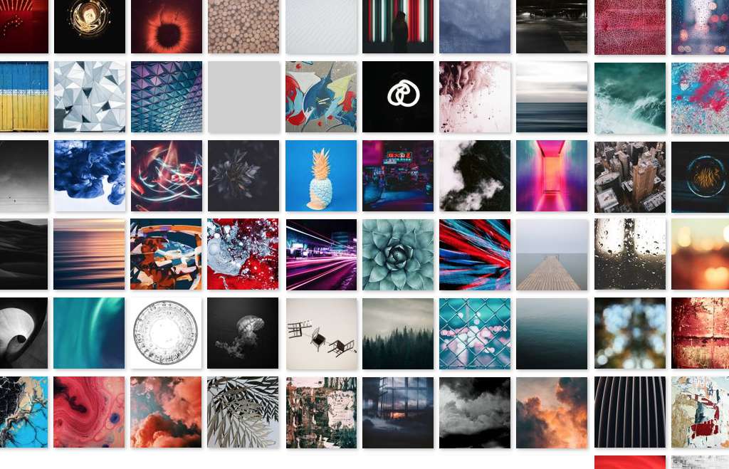
And if you can’t find something you like, you can browse Pexels or Unsplash for abstract or landscape imagery that will help support the feel of your site and music.
Add some motion
Speaking of Pexels, did you know they offer free video clips? Some subtle abstract animation can really add to the ambiance of your site. Also check out Distill and PIxabay videos as they offer some great clips as well.
Hide the photo altogether
Many of our themes allow you to adjust the Header Image height. It even allows you to adjust the height to 0% so that there is no Header at all. Just be sure to remove your call-to-action header before you adjust the height and then go at it.
Create a beautiful mobile-friendly website for your music in minutes. Try Bandzoogle free today!
Make your hero image a hero
One common problem I see is that a site’s hero image doesn’t conform nicely to the rest of the website’s color palette. Perhaps the bass player wore an ugly orange t-shirt to the photoshoot, or maybe that warm rusty brick background behind your band clashes with the nice cool palette you’ve selected for your site and album art.
Of course, you could easily switch themes with a couple of clicks, but sometimes you want to stick with the theme you’ve picked and just get that one photo to work with the rest of the design. This is where the Header Image Filter comes in handy.
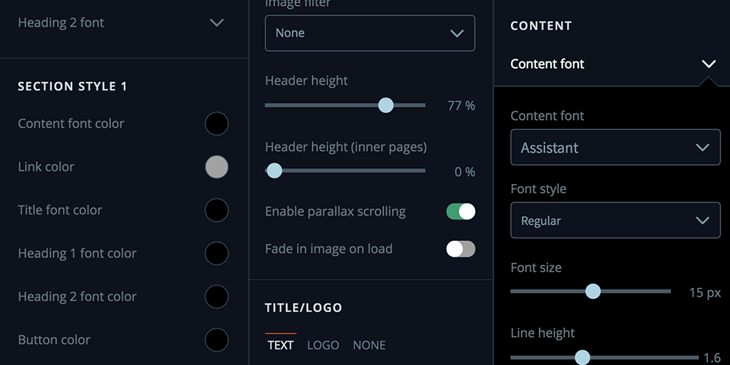
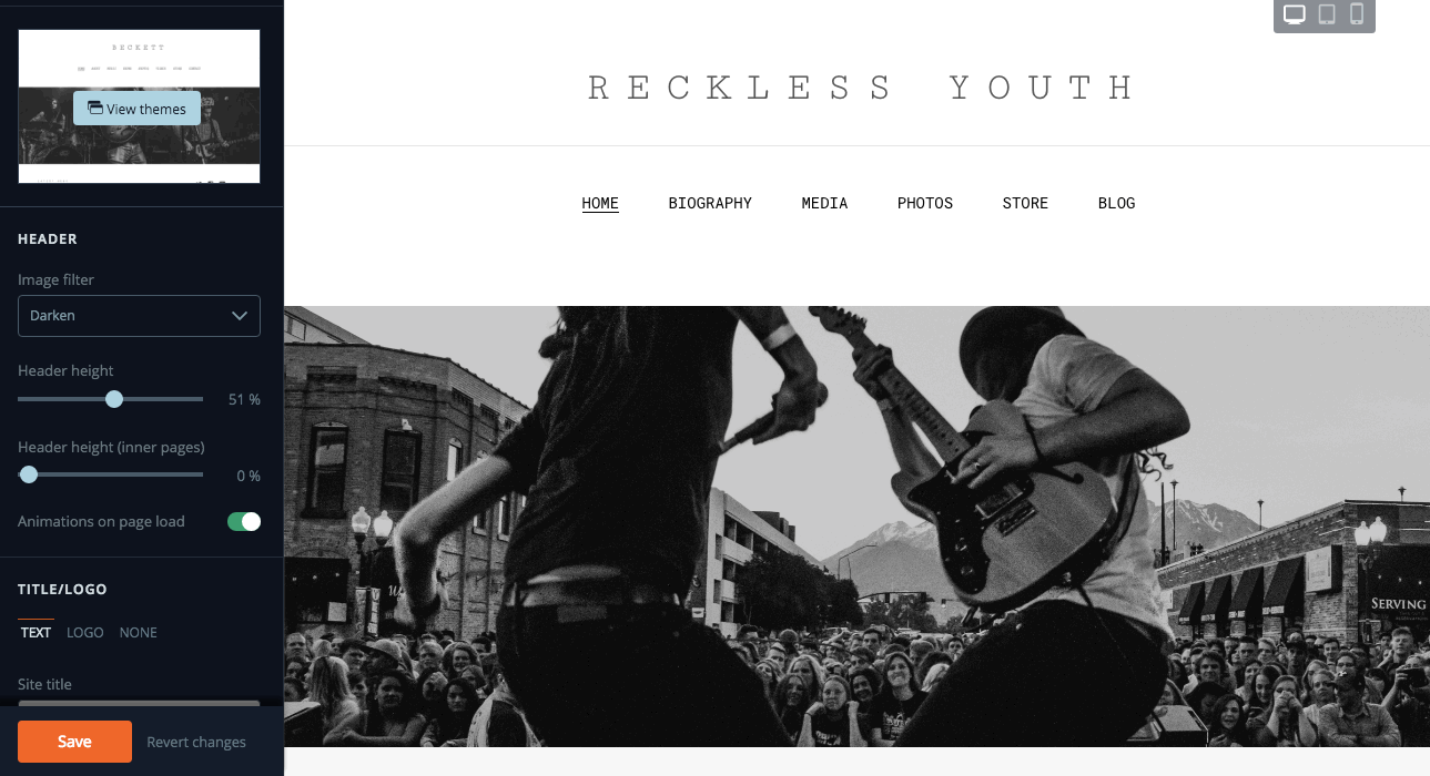
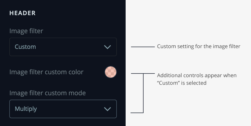
Adjusting the Header Image filter
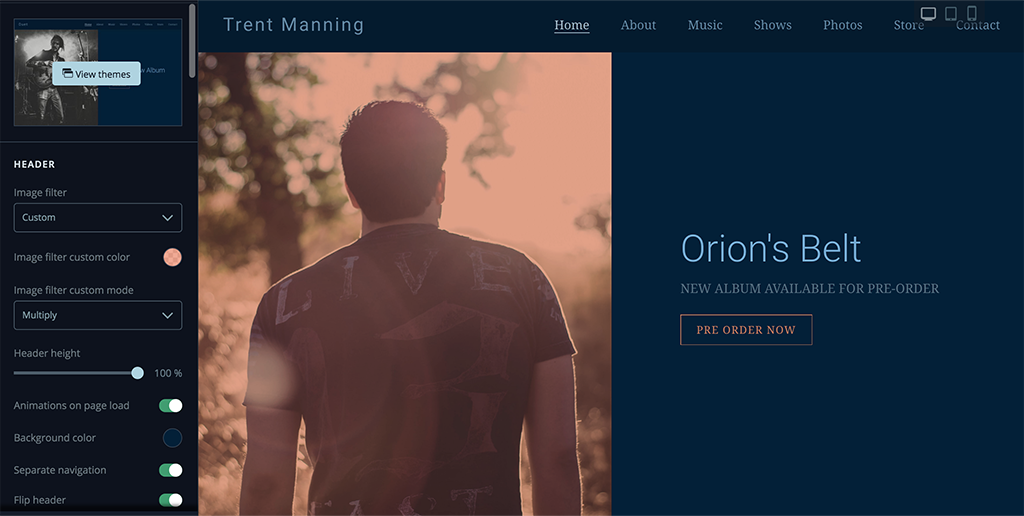
We have some great presets in the Header filter tool, but you can also use a Custom setting that opens up a myriad of color possibilities. Let’s take a look at this site as an example:
This isn’t looking great. We have a nice cool palette from our Duet theme with some salmon/orange accents, but our photo has a lot of earth tones and isn’t playing nice.
Choosing the custom mode
We have a photo with a nice composition and lighting but the colors really clash with the nicely established palette of this theme. Rather than throwing this photo into Photoshop and trying to tweak it, I can just use the Custom Image Filter to adjust the colors.
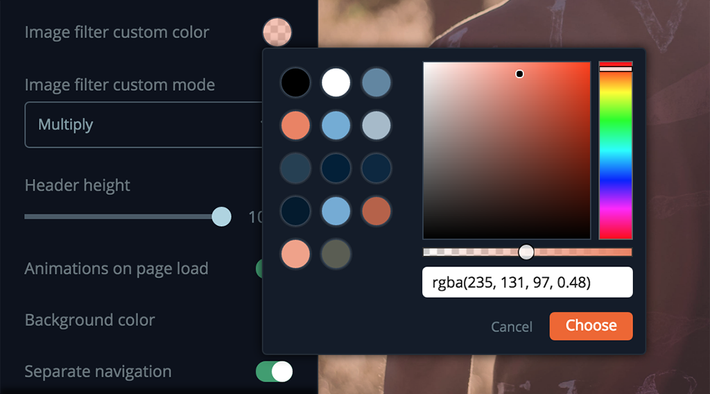
You can do this in the Theme Editor by selecting Header > Image Filter > Custom. Now you’re presented with some additional controls of: Image filter custom color and Image filter custom mode.
If you’ve ever used Blend Modes in Photoshop, the names in the custom mode dropdown will look familiar. If not, no worries as I’ll run through how some of these modes work.
But first, let's chooses a color to conform with our theme’s palette. This should be easy as the color picker tool is already pre-populated with all the colors used in your site.
How the color interacts with your image
Now we just need to finesse this so it plays nice with our photo. We’ll select the salmon-y color as it will compliment the adjacent call-to-action text on the right.
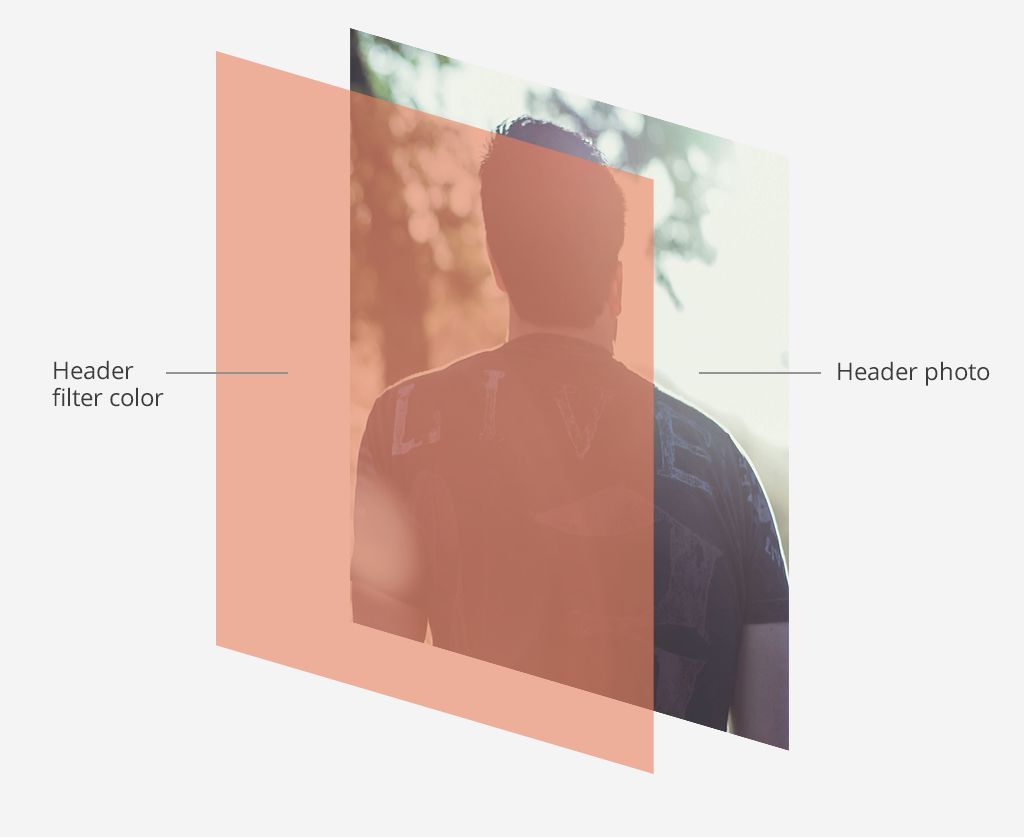
After we select our color, you’ll notice that to completely obscures our image. This is because the color acts like a separate layer on top of the photo.
Custom Filters and what they do
I could just reduce the opacity of the color but instead let’s use a filter. This is where the magic of custom filters comes into play.
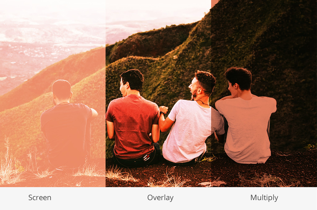
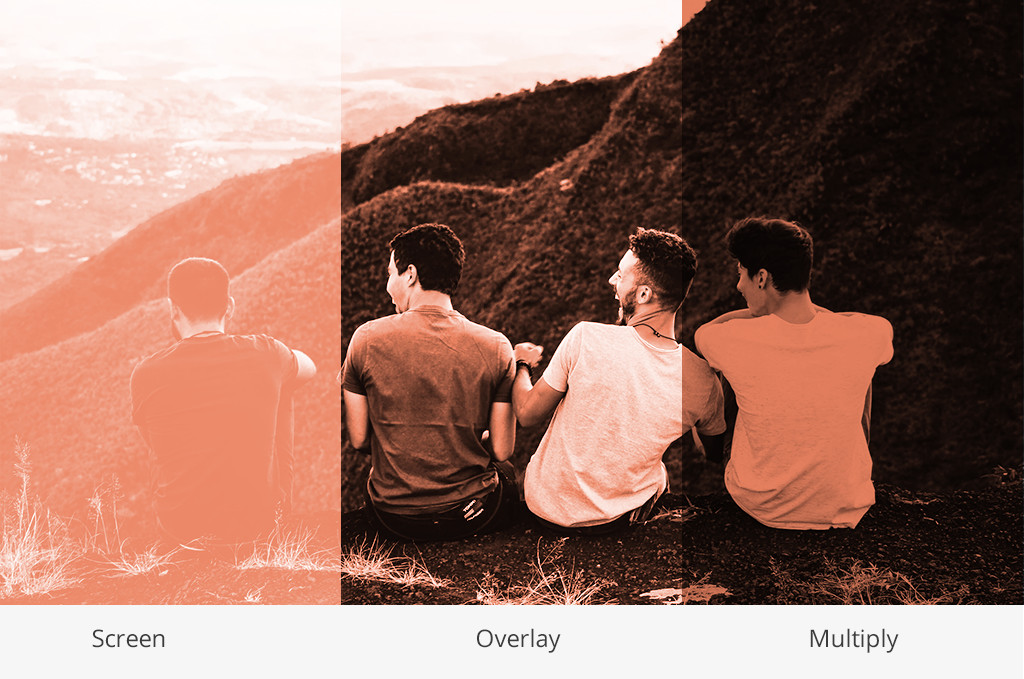
There a quite a few choices here, but I’ll only touch on 3 which are: Multiply, Screen and Overlay. These are the ones I use the most, but encourage you to tinker with all the options available.
If you go to Wikipedia and look up the definitions of these blend modes, you are confronted with equations and color theory which isn’t really helpful. So I’ll try and explain these as simply as possible.
Multiply
In a nutshell, Multiply makes your color layer act like a colored transparency and darkens the image below it. The photo will become darker and toned with the color we’ve chosen. I like using this one when I need text to pop off a background image, as it makes the photo recede into the background.
Screen
Screen is the inverse of Multiply and will tint and brighten the photo with your color.
Overlay
Overlay is a combo of Multiply and Screen. If we think of Multiply as producing dark results and Screen as light, we think of Overlay as somewhere in between.
The other custom filter modes
Like I said, I encourage you to tinker with all of these settings but one way to remember how these filters behave is to think of Multiply and Color Burn as our darkening filters, Screen as our lightening filter, and Soft-Light / Hard-Light as contrast filters.
For our demo site, I’ve decided the Multiply as looks best and now our site and header is looking really cohesive.
Take it up a notch
If you want to take this even further, using black and white photos can give you some dazzling results. They basically absorb the colors from the custom filters and look like a duotone or a 2 color printed poster.
Make your CTA pop
Every month we do a review of our last theme released. We look through dozens (sometimes hundreds) of sites that are using the latest theme.
I would say the #1 design issue I come across is the header text not having enough contrast. Meaning, the text is not readable because there is not enough contrast between the text and the background image. Some photos are just tough to get the text on top of it to be readable. This is where the Theme Editor comes into play.
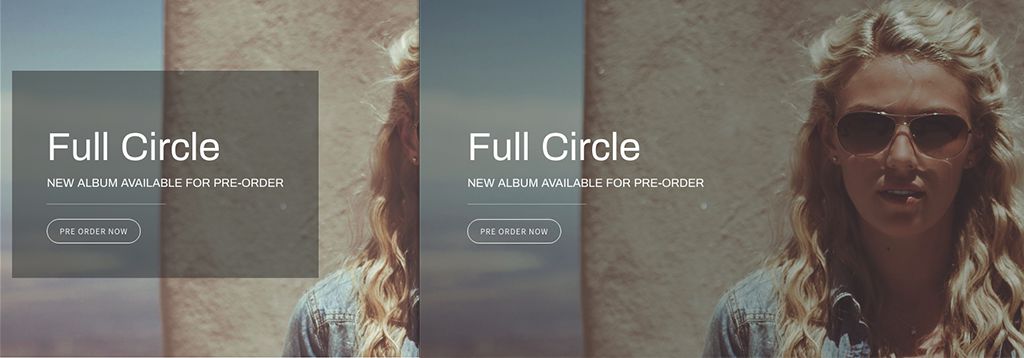
Adjust the Call-to-Action background
In the Theme Editor we let you add a background color behind the the text. You can do an ever so subtle transparent black that will give your text just a tiny boost of contrast.
Adjust your Header Photo
Calling back to the custom filter tutorial above; you can use a semi opaque black or gray in the Custom Image Filter to just barely dull your photo so your text starts to pop forward.
Bold that font
Sometimes all it takes is just using a heavier weight of the font. Easy as that.
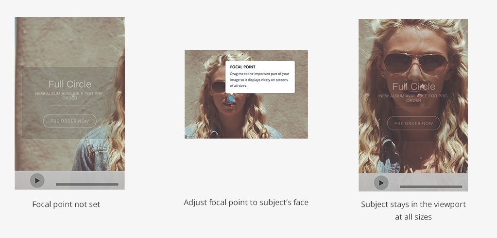
Make your Header Image look great on all devices
We just introduced a new cropping tool for headers that is fantastic for making sure your header photo flexes to any sized screen. So instead of getting this:
[example of image with band on right CTA on left on desktop fine on mobile just shows blank screen with band off the screen]
You can get this using the focal point tool:
Now get cracking
Not everyone is a designer, but with Bandzoogle you have all the right tools at your disposal to make your designs sing. Hopefully these tips will help you the next time you find yourself in the Theme Editor.
Why not share this with your friends?
Build a stunning band website and store in minutes
- Promote your music on your own unique website.
- Sell music & merch directly to your fans. Keep 100%.
- Grow your fan base with built-in marketing tools.
Free 30 day trial, no credit card needed.

Comments
There are no comments yet.