
 A music website is not only a way to maintain a curated, direct connection with your biggest fans, it’s also an opportunity to express yourself online. You have control over how your website looks, you can organize it however you like, and it can include everything you need to promote your music in a methodical yet creative manner.
To engage your fans and impress industry professionals alike, design a music website that shows your personality as well as your music. We’ve put together a list of important features along with examples of the best music website designs to inspire you.
1. A visually engaging image
When someone visits your website you only have a few seconds to make a big impression. The quickest way to grab attention is with an engaging header image. A strong header image is arguably just as important as the music you include, and will encourage your visitors to engage further with your music.
An inspiring main image also sets the tone for your entire website. It should convey your brand, your vibe, and your sound all at once. Choose an image that shows you in your element, be that performing or co-writing or just posing with your bandmates in a way that feels natural.
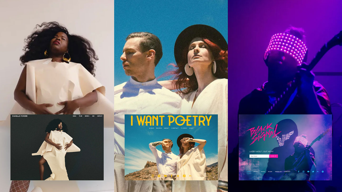
Experimental electronic band Black Signal melds their header image seamlessly into a design that uses navy and pops of pink, drawing the vibe and colors of the main image into the rest of their website design.
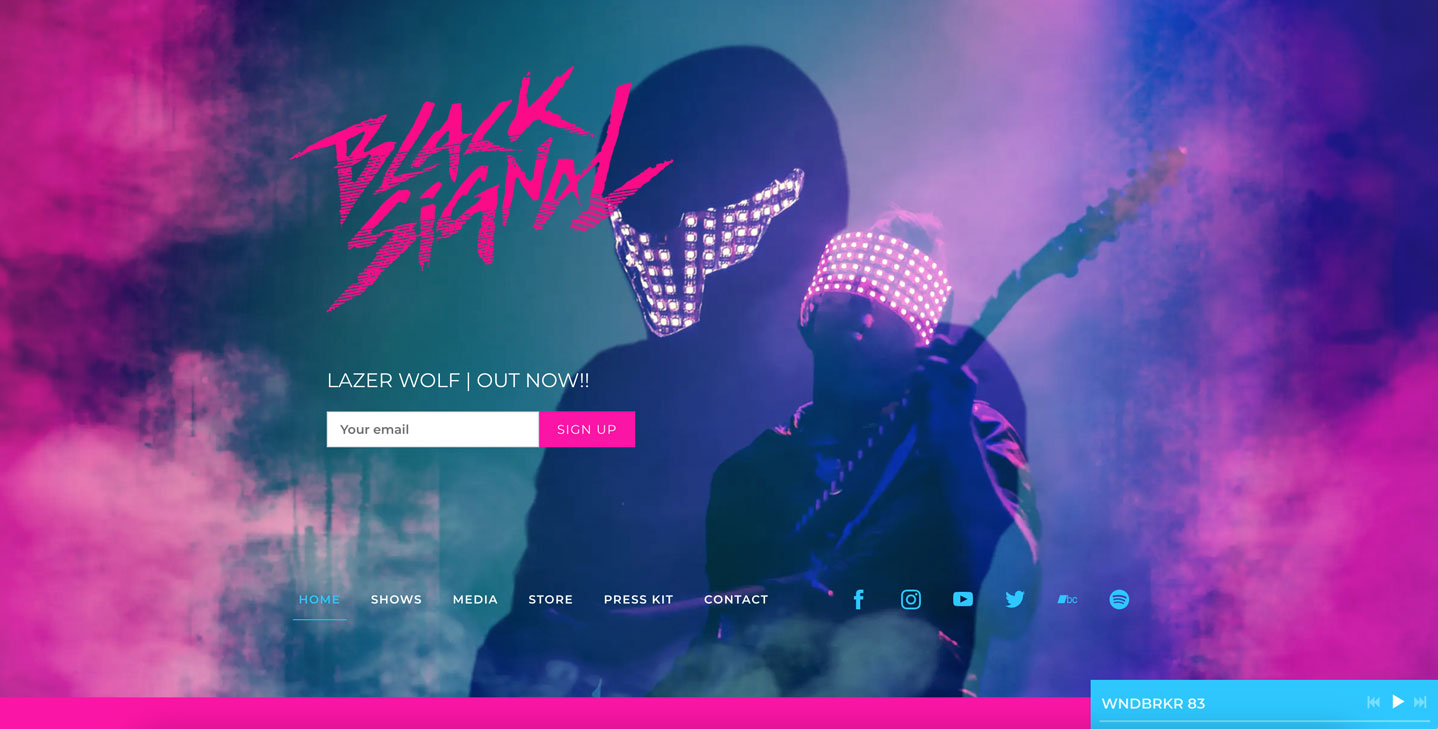 Music website example: Black Signal
2. Use whitespace to emphasize content
Creating a website from a minimal music website template allows for plenty of videos, photos, and media to bring your band’s sound to life across all your pages. Using whitespace is key to a minimal, clean look. It allows for padding (space) on your page and around content, to let it ‘breathe.’
Minimalism instantly gives your website a professional look–even with plenty of content, the extra space makes pages appear uncluttered, and the fonts appear crisp and clean.
Using whitespace to create a minimal yet engaging website is shown to good effect by composer Ghost Girl. They’ve taken advantage of a clean white slate with a sidebar to add music in carefully-curated batches.
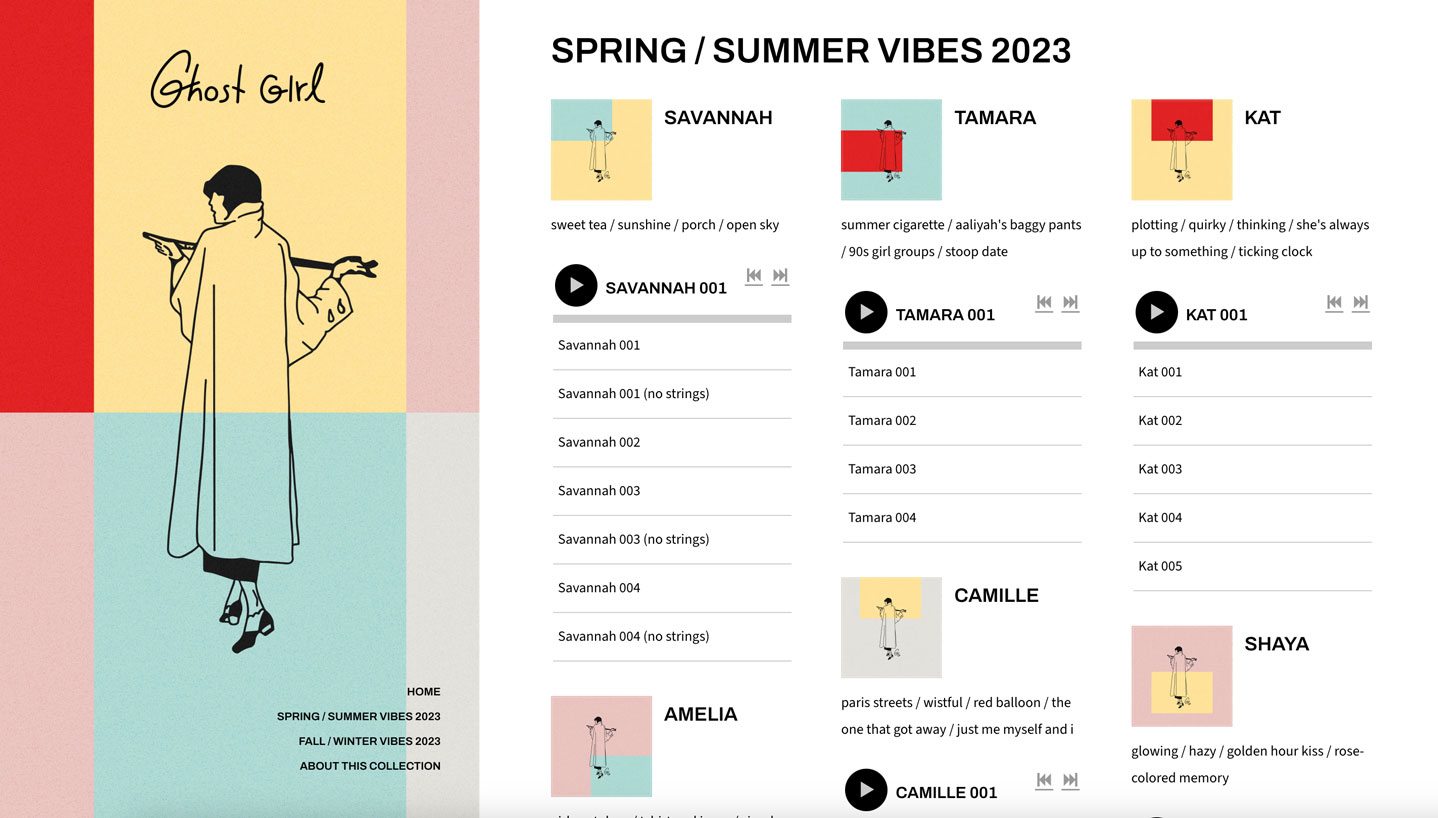 Music website example: Ghost Girl
3. A video header
Using a video header to lead your website design can create a feeling of excitement, or spark interest for the rest of your music website. Make sure the video header isn’t long (about 10 seconds is great), and set your band name, social media icons, and menu overtop of it. This combination of static text and motion behind it is a great way to make your website visitors stop and take notice.
Electronic psych duo forceghost use a simple video header to underscore their sound, with meddling colors and texture. In addition to looping perfectly, it sets the tone which the rest of their band website follows.
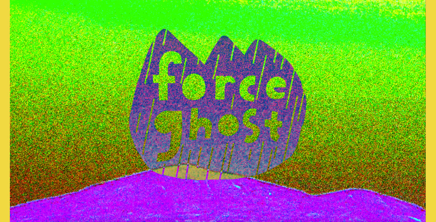 Music website example: forceghost
4. Website animation
One way to be sure your website design stands out is by using subtle animation. This could include your artist name, menu, and call-to-action floating seamlessly into view as your page loads. This animation sets you up with an on-trend website that immediately engages your fans' interest.
Alt-pop band Caveboy creates a sleek look for their website using loading animation on their logo and menu. Matched with a stylized header image, clear menu, and subdued color scheme, the animation sets a memorable tone.
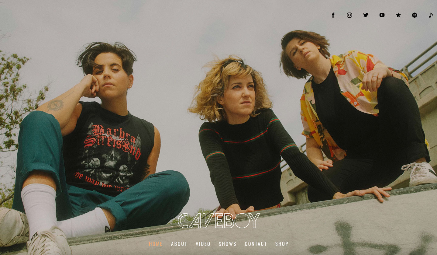 Music website example: Caveboy
5. A space to sell your music and merch
Effective website design displays who you are and what you do in a way that stimulates fans to follow and support you online. Make good use of this space–it is all your own, to sell music and merch directly to your fans. Selling merch online can provide extra income and is also a great way to connect more fully with your fans.
Duo Wolf & Moon have set up an eye-catching store in a grid layout, allowing their merch to shine. Their Store page is set up in clear sections, with different releases showing as you scroll down the page. Using a grid layout allows each product its space, and simple backgrounds set off their album art beautifully, creating a vibe that goes with their overall website’s aesthetic.
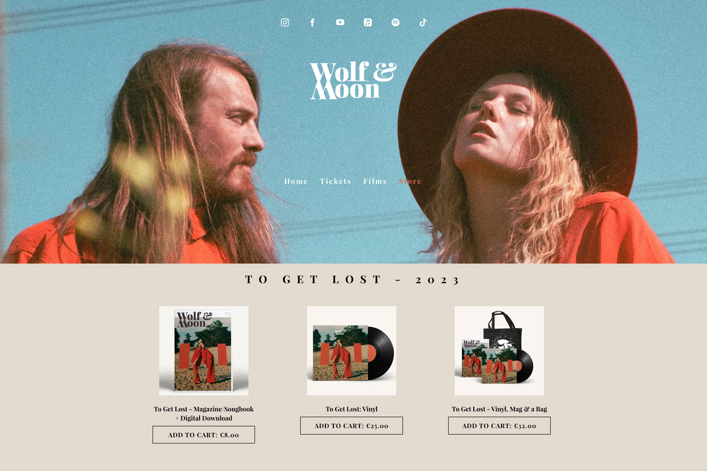 Music website example: Wolf & Moon
6. Coordinated color palette
Telling your band’s story is made easier when you select a color palette that matches the vibe of your music. To help with this, choose a website template that appeals to you (the header space available, the menu style, and the content area layout), and then add your main image.
From there, use colors from the header image to create sections with titles, text, and buttons all in the same color scheme. The result will be an artist website that feels familiar and natural to your fans, encouraging them to return time and time again.
Indie pop duo I Want Poetry evokes a feeling with their website coordinated in shades of gold and blue. White is the perfect accent color to set apart page names in a clear menu, with background imagery setting off sections throughout their pages.
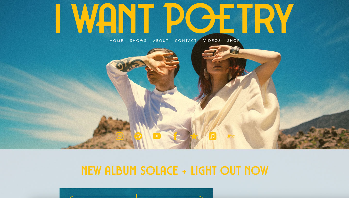 Music website example: I Want Poetry
7. Use a call-to-action
To be sure you’re making the most of engaging every visitor landing on your homepage, add a ‘Call-to-Action’ feature. A call-to-action is the perfect way to focus attention on an upcoming single release, an album pre-order, a new video, or to point out your fan subscriptions service. You can also use a call-to-action to build your mailing list in an organic way.
As a design element, the ‘Call-to-Action’ feature adds dynamic energy to the header section by tying together your artist name or logo, and the site menu. Rapper Haviah Mighty uses a striking header image to evoke a mood for her music, and has added a call-to-action with a contrasting button to draw attention to her latest single.
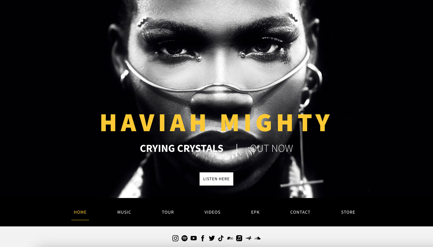 Music website example: Haviah Mighty
8. Draw on your branding
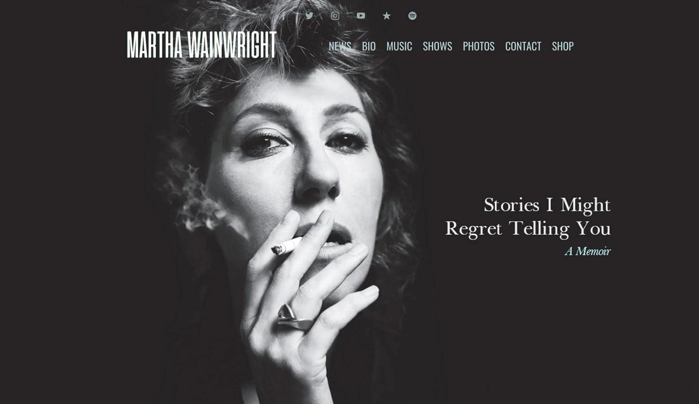
When you create a music website design you want your fans to feel inspired and comfortable. One huge convenience of building your own website is that you can update the colors, images, fonts, and content at any time. Try updating your website design from time to time– you can match it to the look of a new album, promotional push, or project. Pulling from the graphics already created for your new album, single, or video, images can be easily uploaded, and will create a visually immersive experience for your fans.
Singer-songwriter Martha Wainwright uses this concept to great effect, designing her website to accompany the release of her memoir plus a digital deluxe edition of her latest album.
 Music website example: Martha Wainwright
9. Pops of bright color
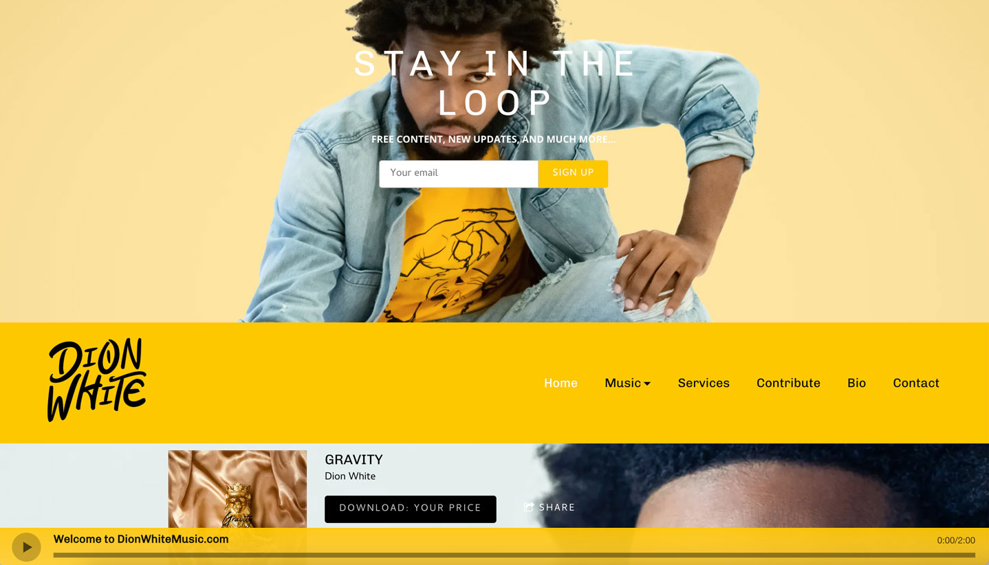
Every musician aspires to translate their melodies and sense of self to the page. A website should portray a distinct vibe that matches the tone of the music. Carefully choosing bright and vibrant colors can express a specific energy and encourage fans to browse through your pages and learn more about you.
Dion White’s hip hop website includes a full-width image that leaps off the page. Right away visitors get a sense for his music and style. His website makes good use of bright colors for an on-trend appearance, flanked by a clear menu with plenty of content to follow per page.
 Music website example: Dion White
10. A structured and stylish feel
One website design trend that makes a site feel modern is the clever use of page sections. This means breaking up content into manageable chunks, and styling these areas to create a cohesive look throughout your pages.
By using a clear color scheme and borders to delineate your content, sections can pull a page design together, for overall flow.
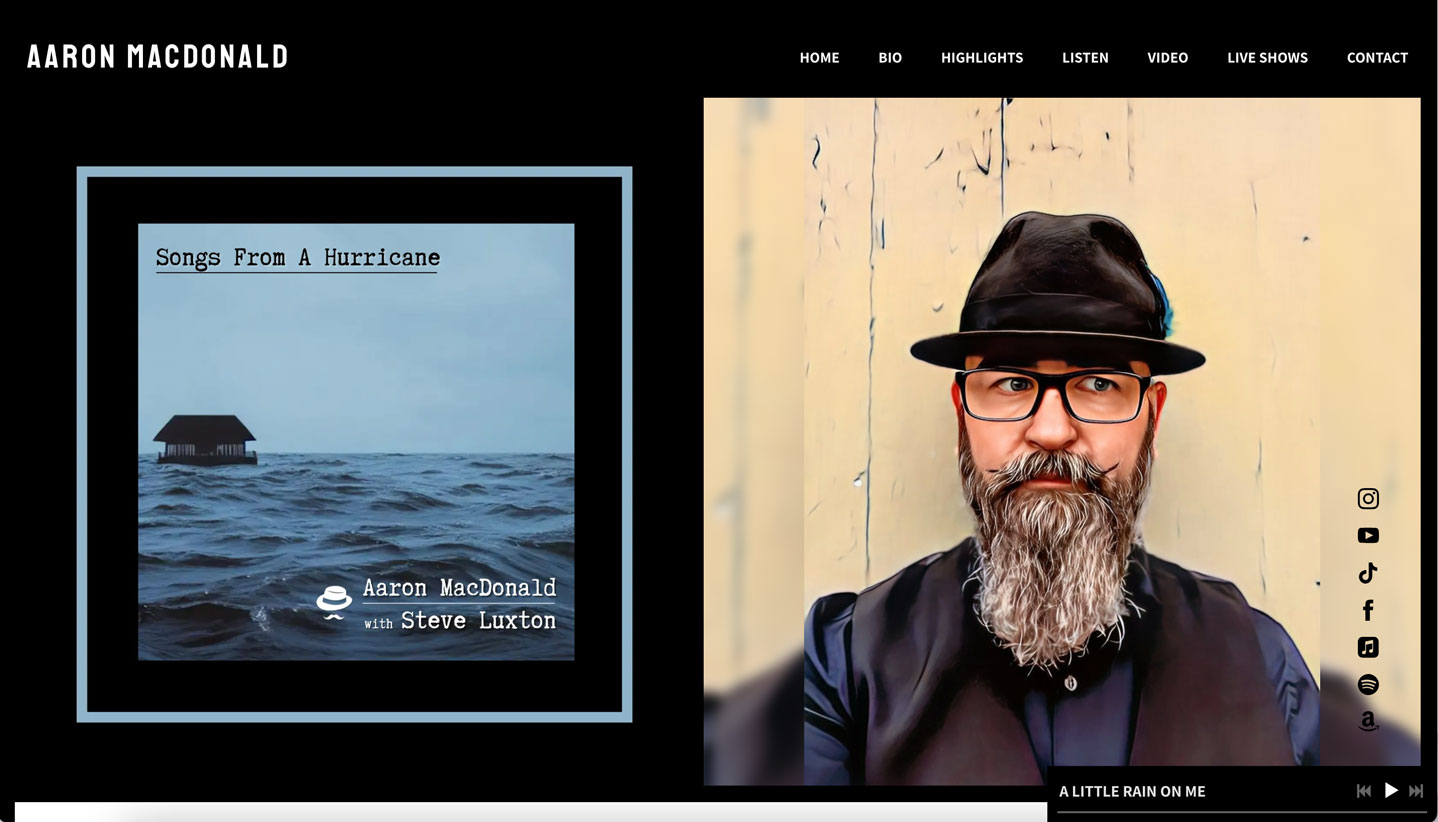
Songwriter Aaron MacDonald makes considerate use of sections to build a one-page website that appears professional right away. His design includes a split header featuring both a portrait and his new album. The clean sections make it easy to listen to his music and learn more about his accomplishments.
 Music website example: Aaron MacDonald
11. A striking logo
A key way to create a website design with consistent branding is by using a strong logo. Your band logo should be stylized to reflect your sound. You can use a logo as inspiration to set the colors of your section titles, social media icons, play buttons, and song names. When clicked, the logo at the top of your website will return visitors to your Home page as a reset point.
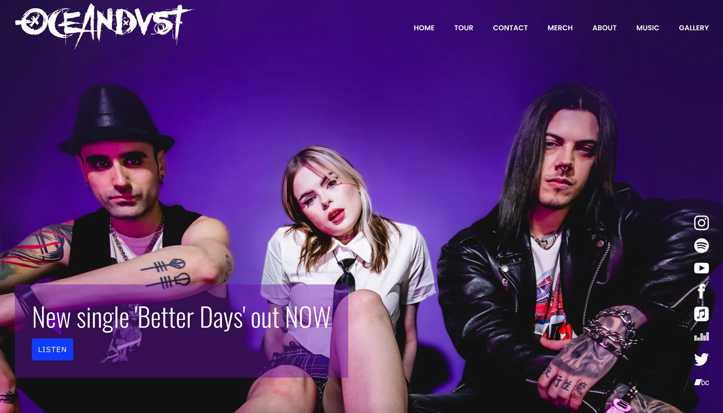
Pop-punk trio OCEANDVST anchors their website design with a logo that shows their band name in a stylized font. Particularly on the inner pages of their website, their logo stands out, keeping their band name top of mind without distracting from each page's purpose. The band logo also appears on their merch – a smart way to maintain recognizable branding.
 Music website example: OCEANDVST
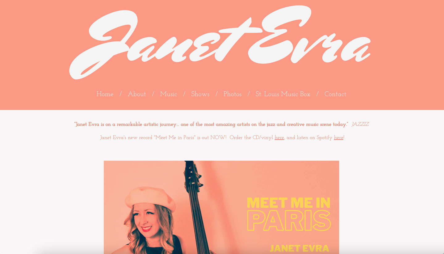
12. Oversized typography
Another web design trend that has influenced the look of modern musician websites is oversized typography. Choosing a strong, large font will help to establish what is important on your website – you are branding and promoting yourself first and foremost, especially if you’re a solo artist.
The website design of jazz artist Janet Evra is a quirky yet stylish example of oversized typography to set a tone. Used to display her artist name, and flanked by a clear menu and simple content area, Ezra’s oversized font title becomes a design element that balances out the look of her website.
 Music website example: Janet Evra
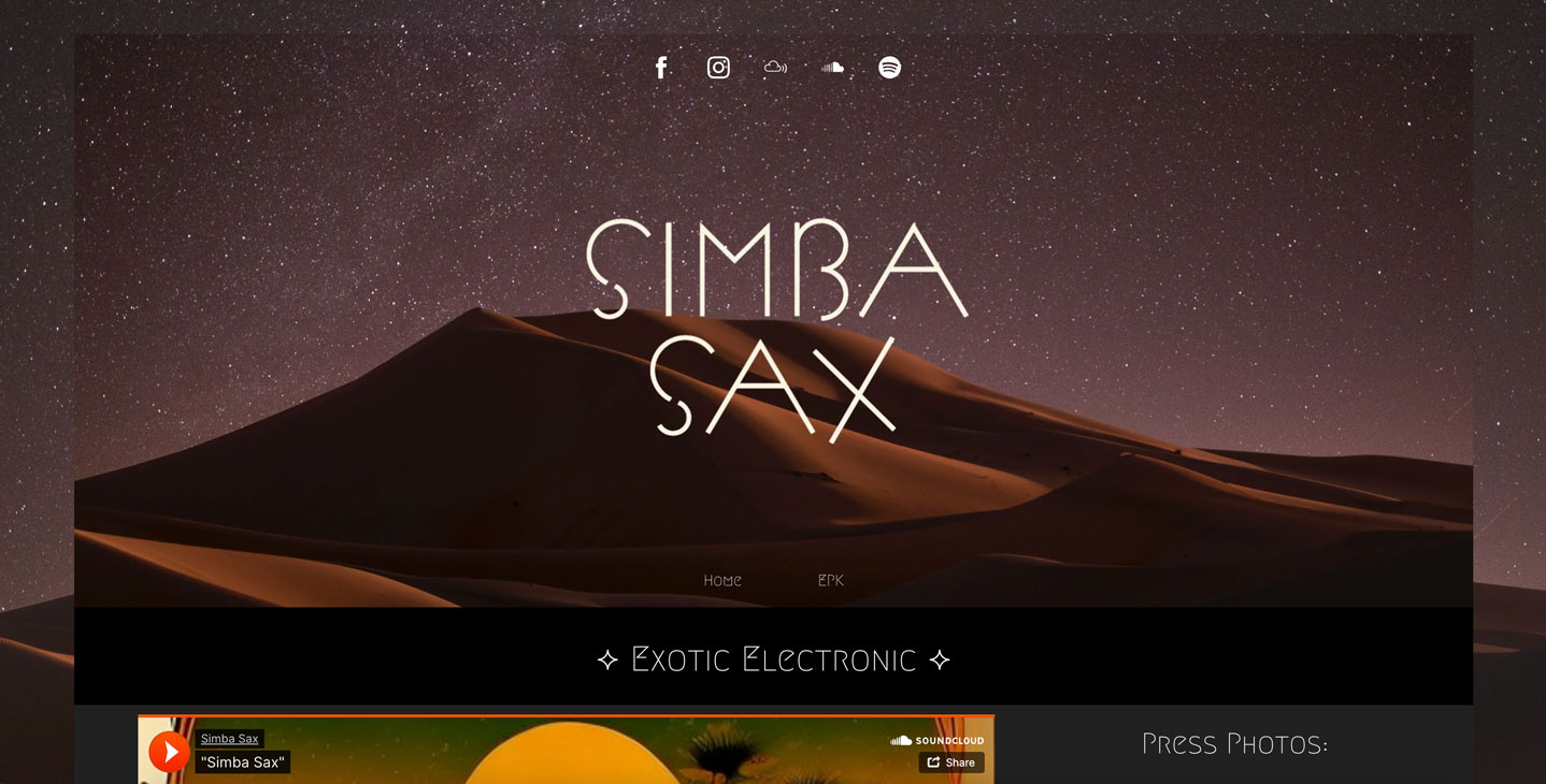
13. Abstract imagery to set a mood
The abstract art trend works beautifully for music websites, providing versatile backdrops for text and photos. Using a non-band photo offers you creative freedom to draw on album artwork, or create an atmospheric look that reflects your sound.
DJ and producer Simba Sax does just that with their thoughtful music website design. The site displays abstract imagery mirrored between the header area and the fixed background of the page. The color palette of the content area provides a stark contrast of clean lines and uncommon fonts, making the text, photos, and music hard to miss.
 Music website example: Simba Sax
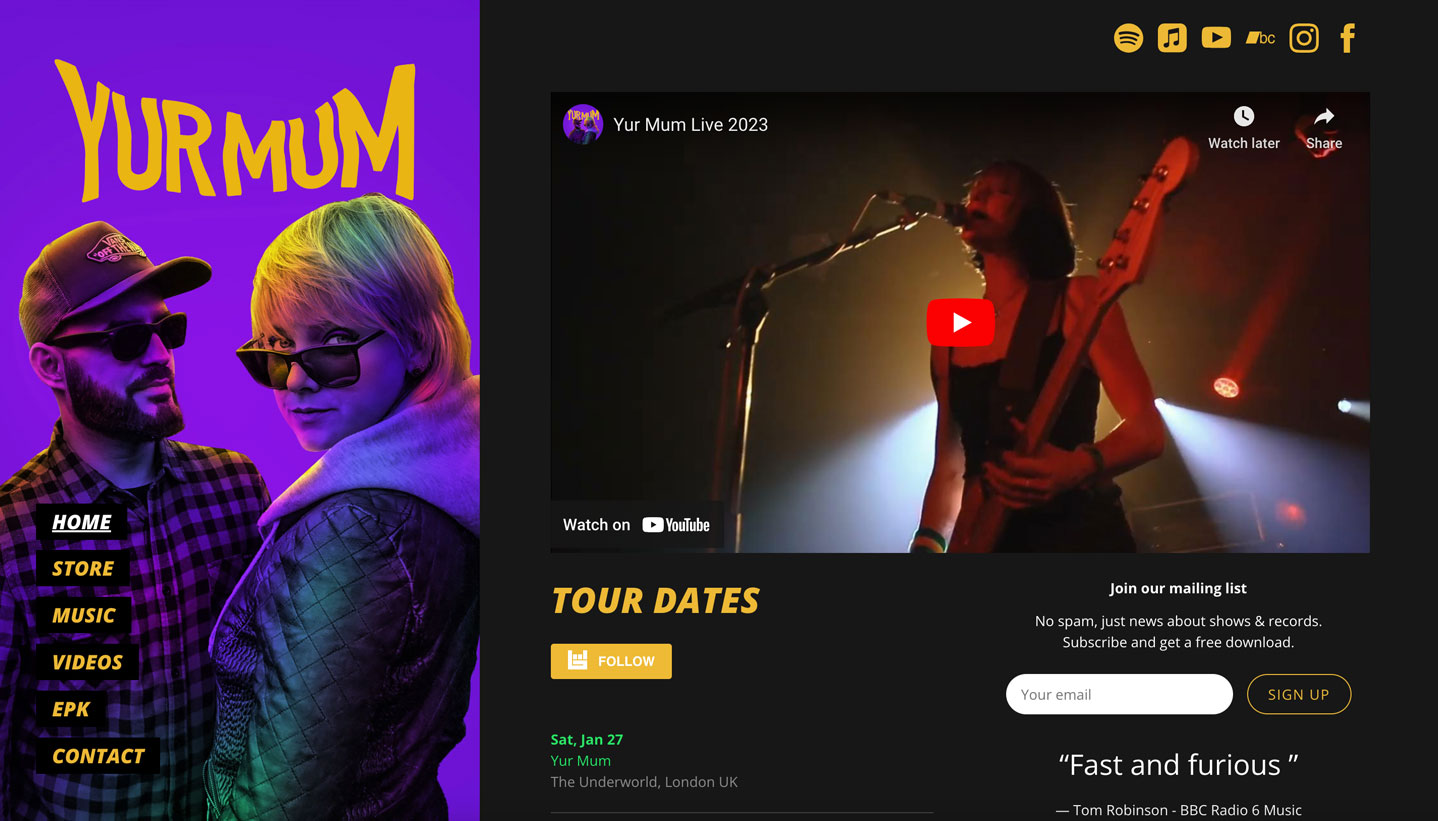
14. A sidebar menu to add structure
A fixed sidebar menu will help your website visitors navigate your content with ease, while maintaining a fluid, stylish look that’s less conventional than the common horizontal website menu. To make the most of a website with a sidebar menu, break up content into manageable chunks and then style these areas to create a cohesive look throughout your pages. Plain backgrounds often work best for page sections in this style.
Rock duo Yur Mum uses vibrant imagery to set the tone for their website. They also feature a simple side menu with page name styling that echoes the black background of their content pages.
 Music website example: Yur Mum
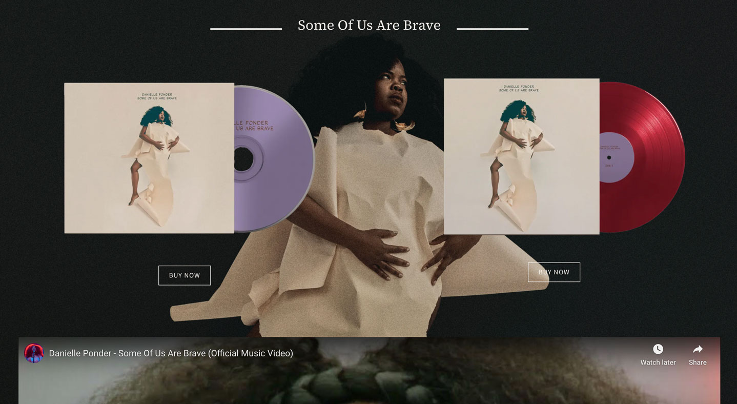
15. Beautiful branding
The clear advantage of creating your own website is that you can brand it exactly how you want. With no design limits, you can build a website that’s a reflection of your overall message and identity, to truly showcase your branding and set up lasting connections with fans.
Singer-songwriter Danielle Ponder uses imagery to build out the vibe of her website. Her album artwork as a background image as well–a smart way to draw attention to her release on CD and vinyl. Using the same imagery to brand her physical music releases as well as her website creates a design that’s both memorable and functional.
 Music website example: Danielle Ponder
All the music website designs featured in this post were created by Bandzoogle members using templates as a starting point. Each one was customized with current website trends in mind, and to showcase the artist’s music in intriguing ways. If you’ve felt daunted trying to get that perfect look for your website, we hope these real-life examples inspire you to create a fresh design to match your music.
Why not share this with your friends?
Build a stunning band website and store in minutes
- Promote your music on your own unique website.
- Sell music & merch directly to your fans. Keep 100%.
- Grow your fan base with built-in marketing tools.
Free 30 day trial, no credit card needed.

Comments
There are no comments yet.