

A custom website is a great way to promote your music and build your fanbase online. One of the advantages to choosing a music website template is that it’s mobile-ready, and all e-commerce works well without you having to do any coding behind the scenes.
But if you’re creating a website to reflect your music, you’ll also want to be sure that it accurately shows who you are, as a person, and as a musician, while you share your songs with the world. And using a website template as a home base really opens up a myriad of design possibilities, allowing you to create a unique look that’s as inspired as your music.
So how do you design a music website that’s unique, but is easy enough to do without a deep knowledge of graphic design tools? Today I’d like to take a look at sections, and full-height imagery: these put together are really powerful ways to tell your story through design on your own music website.
Get started with sections
Websites sections are a relatively new concept in web design and they offer a lot of great things:
- Great way to add delineate portions of content on long pages
- Highlight imagery and add some visual interest to your pages
In the examples below I am taking advantage of our new “Make section full height” setting to create some flair with page designs. This toggle will take any section and have it occupy the full height of the visitors browser. This is a fantastic setting for highlighting photography and imagery on your site.
Build your own music website in minutes with all these features and more. Design your website with Bandzoogle now.
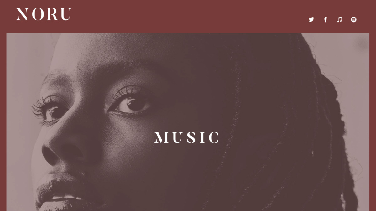
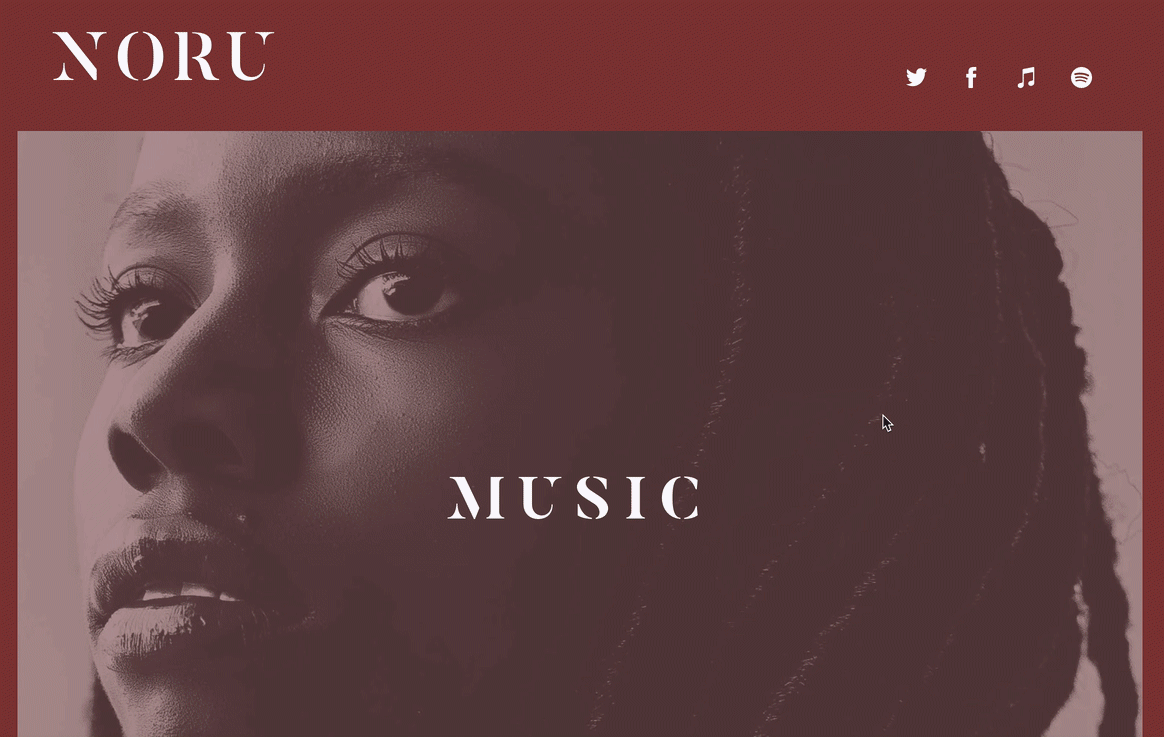
One image, many looks
I was recently browsing some design portfolios, and saw some interesting examples of super minimal homepages that were purely typographic explorations. I liked the simplicity of reiterating the website’s navigation in the body of the page and giving visitors obvious wayfinding into deeper parts of the site.
This spirit of a simple homepage concept works really well for a musician trying to tell their story as well. I worked up a sample site that lends similar visual interest with section backgrounds.
This example works best with a black & white image, but you could pull this off with a full color image and tweak the opacity controls a bit.
Here’s what we’re working towards:
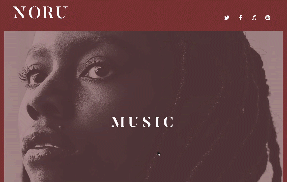
Setting the stage
To achieve this nifty effect with styled website sections, I first set up three separate sections with some large title text that will link to my other pages. And yes, the background colors look pretty nasty together here. This will change once I pop in my background imagery...trust me.
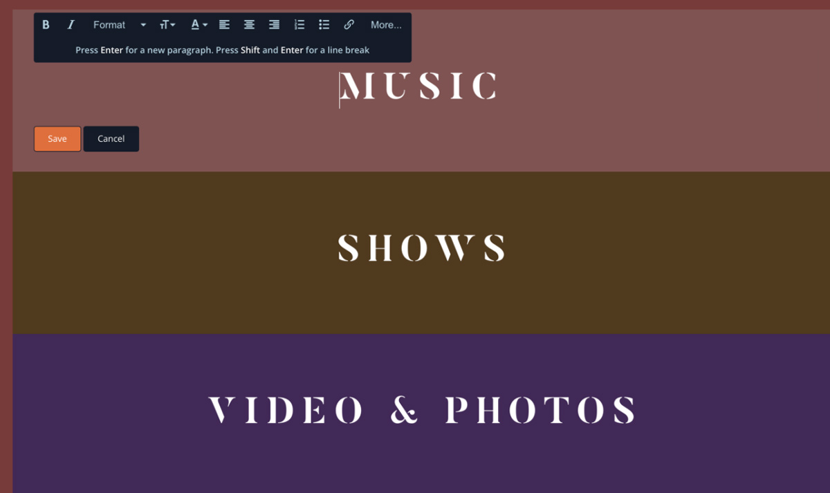 Setting the background
For my fictional artist, I used a single high resolution black and white portrait as my section backgrounds. I am going to use this background for three separate sections and adjust the opacity so that the image inherits the section’s background colors (which are set in your theme’s settings).
This is easier than it sounds to create on your own! My section settings for the image background look like this:
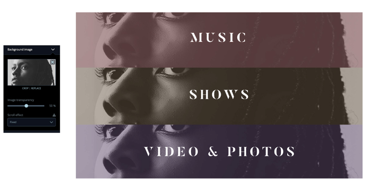 Notice I am also adding the Fixed scroll effect as it’s key to the “wiping” effect. Also notice that my section background colors are looking better now when mixed with the grays and whites of the photo.
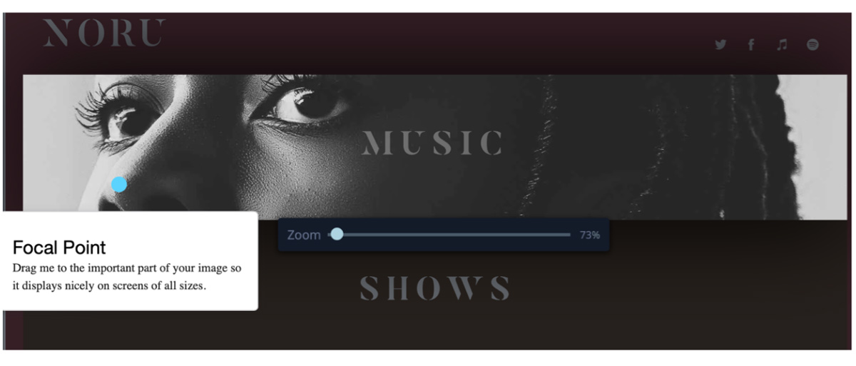
Another important part to creating this scrolling effect is making sure your focal point tool when cropping is in the same place. You can leave it in the center (which is the default position) or choose a spot that’s easily replicable in each section. I chose the tip of our artist’s nose.
Super size it
Now let’s toggle on our full height setting and see how it looks:
Apply this setting for the remaining sections and you should be good to go!
I also wanted to take this example a little further and add some interstitial sections that would kind of act like transitions between the color changing portrait. I used some stock imagery from our image chooser to add some abstract in-between sections.
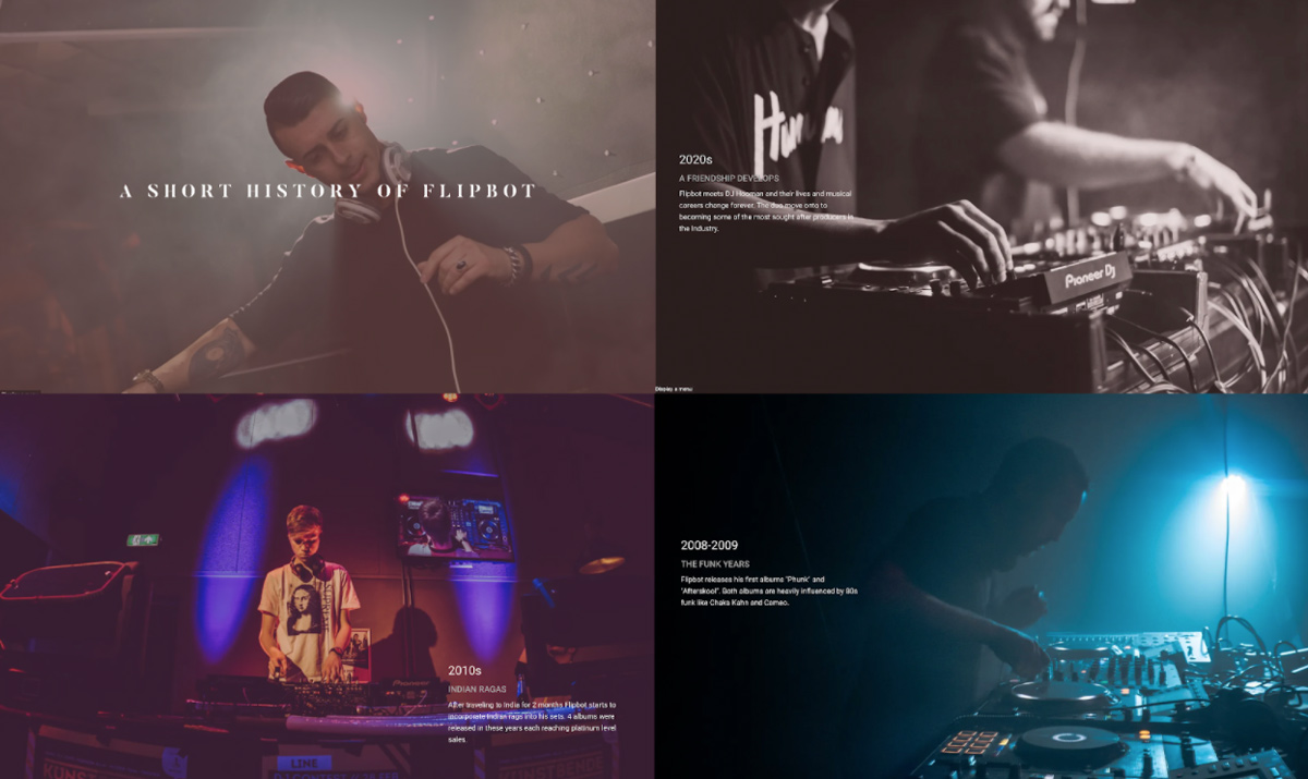
Tell a story
One thing I like about the full height sections is the ability to position text over a large image in interesting ways. I thought this would work great for a “Bio” or “History of the Band” page.
In these examples I am simply using a 3 column layout and positioning the text in places that don't obscure the imagery. Here are some example sections I put together:
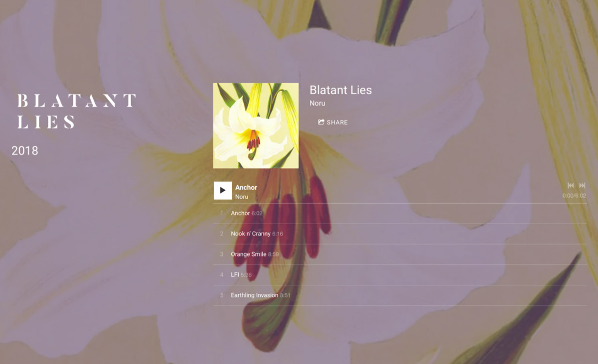
Make a splash
My examples so far have all been centered around text, but we do the same with other features. An idea I like is making a discography page where each album is given its own giant section with the album art in the background.
Musician design example
I noticed some Bandzoogle members using some of these techniques as I was writing up this blog post.
Toronto-based folk duo Basset has a really fun example of this on their About page where they use full-height sections and cleverly similar imagery. They also use blocks of color that play off their images to create a cohesive look at the content scrolls. The result is a really modern and unique, almost quirky effect that suits their music perfectly.
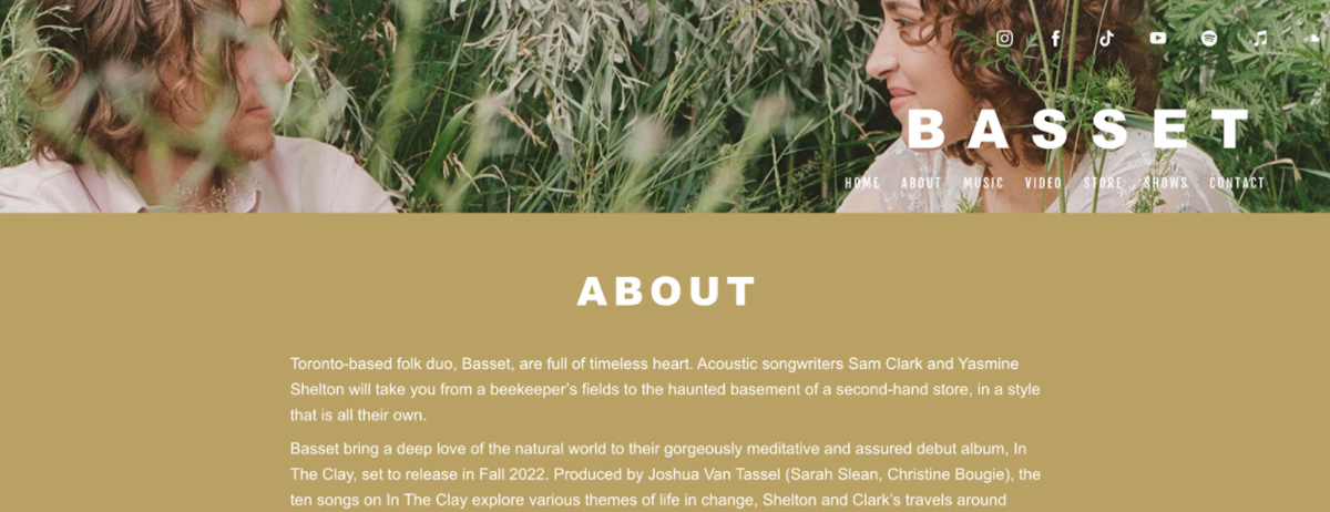 Check it out: https://bassettheband.com/about
I hope this helps stir up some new ideas and creativity when designing your music website. In the examples above I had access to some great photography, which isn’t the case for every artist. I would encourage you to look through the stock imagery options in the image chooser to find something. There are a ton of abstract options that could work for any artist. Cheers!
Why not share this with your friends?
Build a stunning band website and store in minutes
- Promote your music on your own unique website.
- Sell music & merch directly to your fans. Keep 100%.
- Grow your fan base with built-in marketing tools.
Free 30 day trial, no credit card needed.

Comments
There are no comments yet.