
Stand up and be counted, for what you are about to receive, we are the website dealers, we'll give you everything you need! Who doesn’t love rock & roll? We certainly do and we love rock musicians too.
We want you to succeed, and a big part of that is having a home on the web for your music. That’s where we come in. Bandzoogle provides all the tools you need to create an awesome rock music website.
You might want a website, but you’ve been holding off because you don’t want a cookie cutter solution. You are an original, and you want your website to reflect that. We’ve got you covered there too. We have many different template styles and you can customize it to suit you and your music.
[How to design a great rock music website]
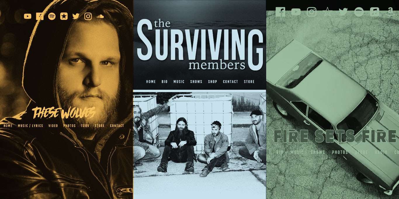
To give you an idea of the flexibility of our rock music website templates, let’s look at a few of our member sites. Notice that all three have chosen our Pulse template, but they all look unique.
Fantastic images
Your template provides the framework for your site, but it’s your header image that makes your website stand out. This one element can make or break your site style, so make sure to use only professional shots.
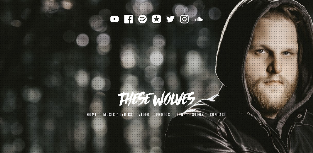
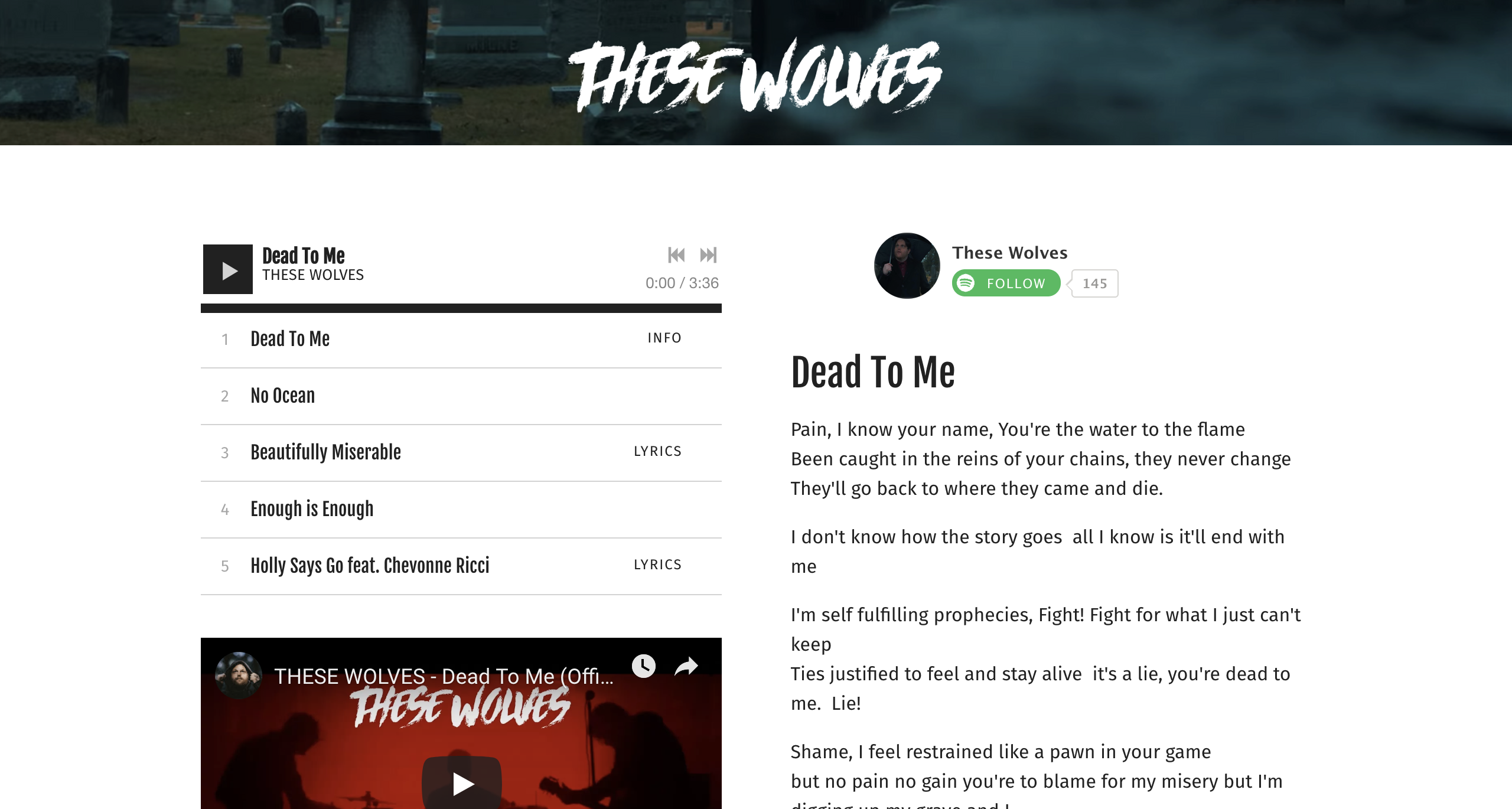
Rocker Darren Fisher gives us a good example of using a strong header image on his homepage. The image highlights his face and gets fans use to seeing him associated with his band name, ‘These Wolves’.
With our built-in image filters (like Instagram) you can change the image colors, or even add a photo overlay.
 If still images are too bland for you, consider adding a photo slideshow or a video to your header instead. The video header displays the action without any sound to bring life to your website.
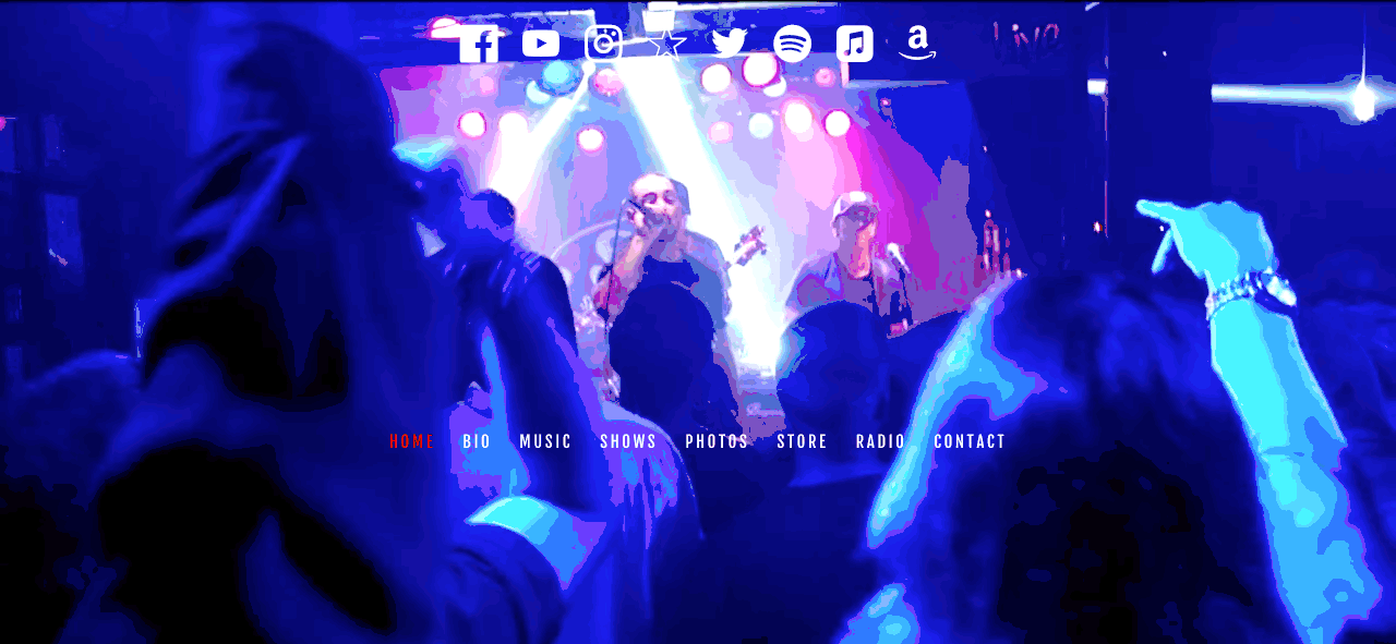
Los Angeles rock band, ‘Fire Sets Fire’, added a video compilation to their header and it’s awesome! It packs a real punch which gets fans pumped and ready to explore more of their website content.
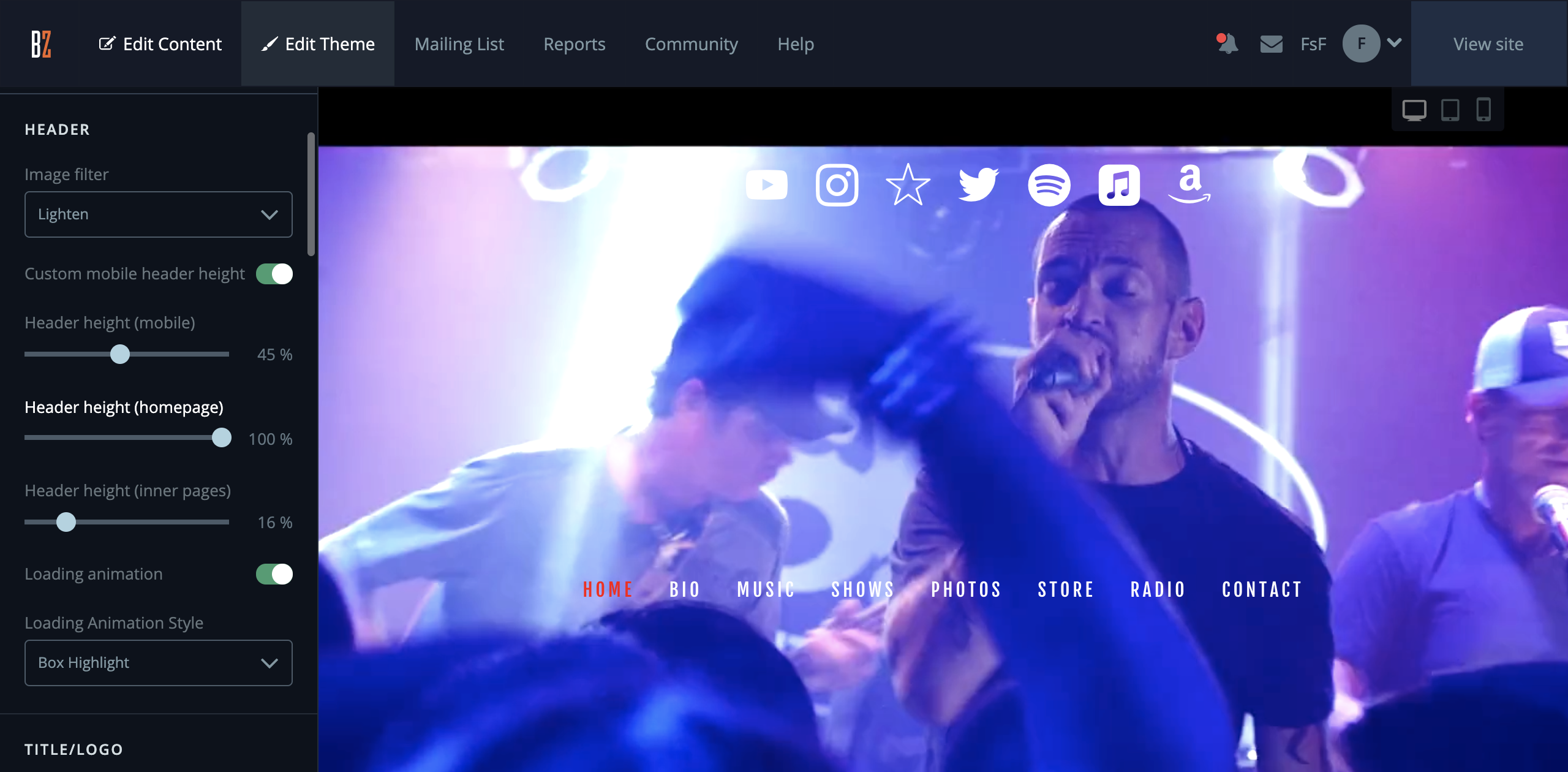
Such great heights
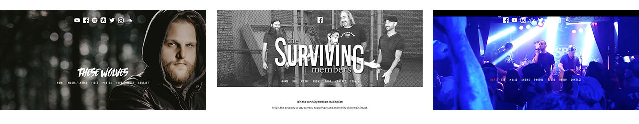
If you’d like more of a subtle change, consider adjusting the header height. Many of our website templates offer the option to choose between a full page header and a shorter header image. You can see the difference here between ‘These Wolves’ and ‘The Surviving Members’.
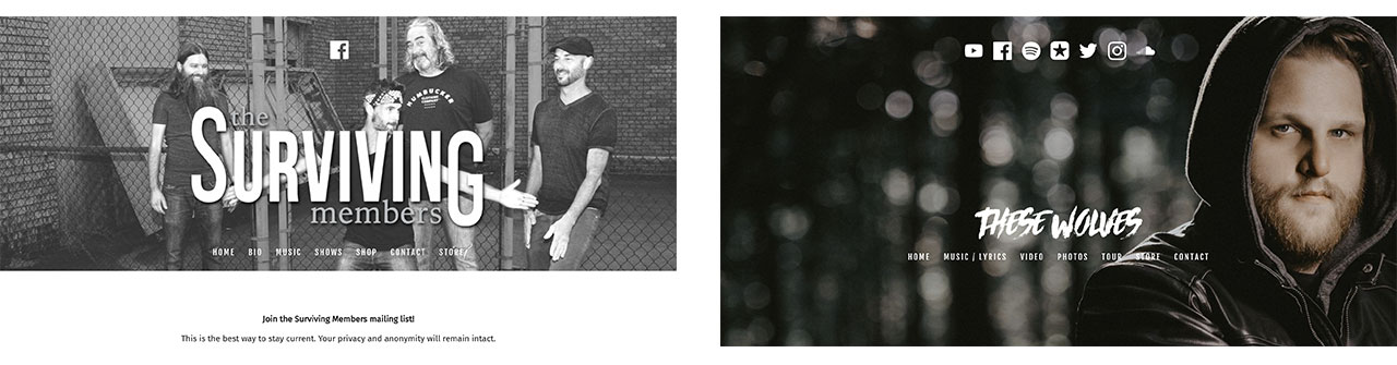
‘These Wolves’ has maxed out the header height to make his image the focus, while ‘The Surviving Members’ focuses on the header title and mailing list sign up in the content area.
The best part is that it’s easy to adjust. From the Edit Theme tab you simply drag the slider to the desired height and click save. You can adjust the height separately for your inner pages as well.
Name of the game
Your name is your brand so make sure it’s prominent in your website header. All of our templates allow you to add either a title or a logo.
With the title option we provide over 150 font styles. Once you choose a style you can change the color, size, and letter spacing. And if you just can’t find a font you love, you can upload your own custom font if you’d like.
If you’ve already created a logo you can use that instead. A logo doesn’t have to be super fancy or costly. You can even create logos in free programs like Photoshop or with Canva. A text logo is a great way to use your band or musician name without having to create something abstract. Check out the logo for rockers, ‘The Surviving Members’.
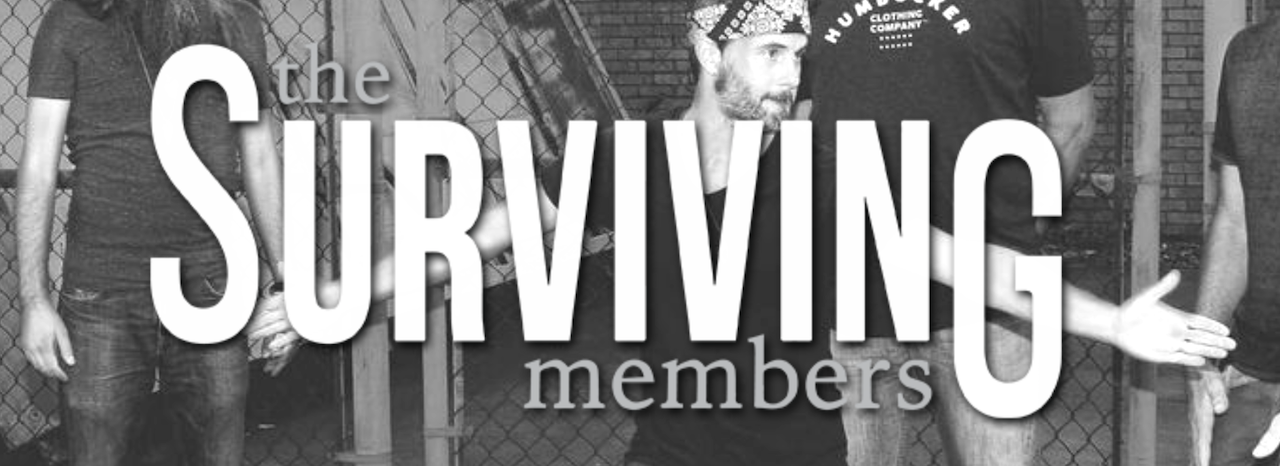 The variation of font sizes, bolding and the added shadowing makes for an eye-catching band name. Whether you use our built-in fonts or a custom logo, we recommend steering clear of silly font styles. Although they can be fun to use, they make a music website look amateurish, which is the opposite of what you want for your music.
Build a professional, mobile-ready rock band website that’ll make you stand out from the crowd. Try Bandzoogle now!
True colors
Just as font style is important, so are the colors you choose for your website. If you’re unfamiliar with design best practices you may end up with too many hues on your site. This can make the site feel disorganized and out of balance.
The good news is there’s a simple solution. Limit your website colors to three or four. If the mood of your music is a bit more serious, you can start with darker colors, then add an accent here and there.
For example, you can use black, gray, and white as your primary color palette. Then throw in red for things like buttons or the navigation menu font color.
 Another way to introduce color is by using styled sections. Here you can make certain sections pop out with a solid color. This is useful for call-to-action (CTA) features like the mailing list sign up form or Store feature.
For a bit more variety you can even upload your own image or a stock image behind any feature as well. The section images can be adjusted further in height and opacity for a truly custom look.
Design Layout
After you’ve added some sections, consider adding more variation with columns. With our content editor this is super easy to do.
You can add columns with a 50/50 split, left or right sidebar, or even a three column layout.
The 50/50 split comes in handy when you have content that complements each other. For example, music players to the left and lyrics to the right. You can also add images to one side and bios to the other on an ‘About’ page for example.
The sidebar options work well when you have important text content such as a blog but you want to display other features like social media icons. The sidebar is also a great place to add summary views for your events calendar, or a mailing list sign up form.
Although not used as often, the three column layout is beneficial when you have content you’d like to display like sponsor logo images, or press quotes.
Bring it together
After you’re done adding and adjusting all the custom options, you’ll want to click ‘View your site’ to see your masterpiece. This is the way fans and industry folks will see your site, so take note of what works and what needs a bit of tweaking.
The best part is that any design changes are quick and easy once the template and content have been added. You can even make minor updates on the road if needed.
 The first step is to choose a template, then the sky's the limit. You have access to change title animations, buttons, link colors, and more. Once you get started it’s actually fun to see how much you can do with one template.
This blog post highlighted only three rock band website examples, but you can get more inspiration by checking out Website Design Inspiration: Best Rock Band Websites, our blog and examples page as well. With all the available options, you’ll be showing off your rockin’ new website in no time!
Why not share this with your friends?
Build a stunning band website and store in minutes
- Promote your music on your own unique website.
- Sell music & merch directly to your fans. Keep 100%.
- Grow your fan base with built-in marketing tools.
Free 30 day trial, no credit card needed.

Comments
There are no comments yet.