
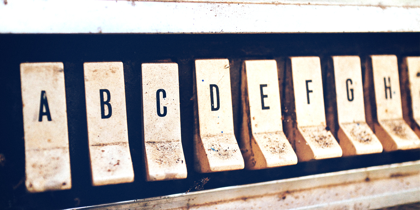
While a picture is worth a thousand words, sometimes you also have to think carefully about those words, too. Selecting the right font can really tie together your website, giving it a cohesive look and feel. It’s an important factor in your overall branding.
Good quality fonts are in abundance nowadays. So with this deluge of options, how do you choose the right fonts for your band website?
We feature over 100 fonts to go along with our templates, plus you can upload your own for a truly personal look. Let’s take a look at some of these fonts, and how they can convey your message.
It’s all about tone
When choosing fonts for your band website, or even a band logo, you should really be considering the tone you want to present. Tone is another way of saying, "how does this make you feel when you see, hear, or experience this?"
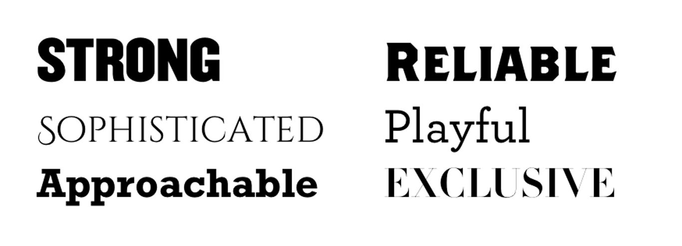
In the examples below I tried to match up some adjectives with an appropriate font. If the font is bold, sturdy, and compact, it can convey strength or even reliability.
Sophistication can be represented by a font with thin elegant serifs. The playful example has rounded terminals which give a bit of a whimsical feel.
Now let's try to match some of those adjectives to some music terms and genres:
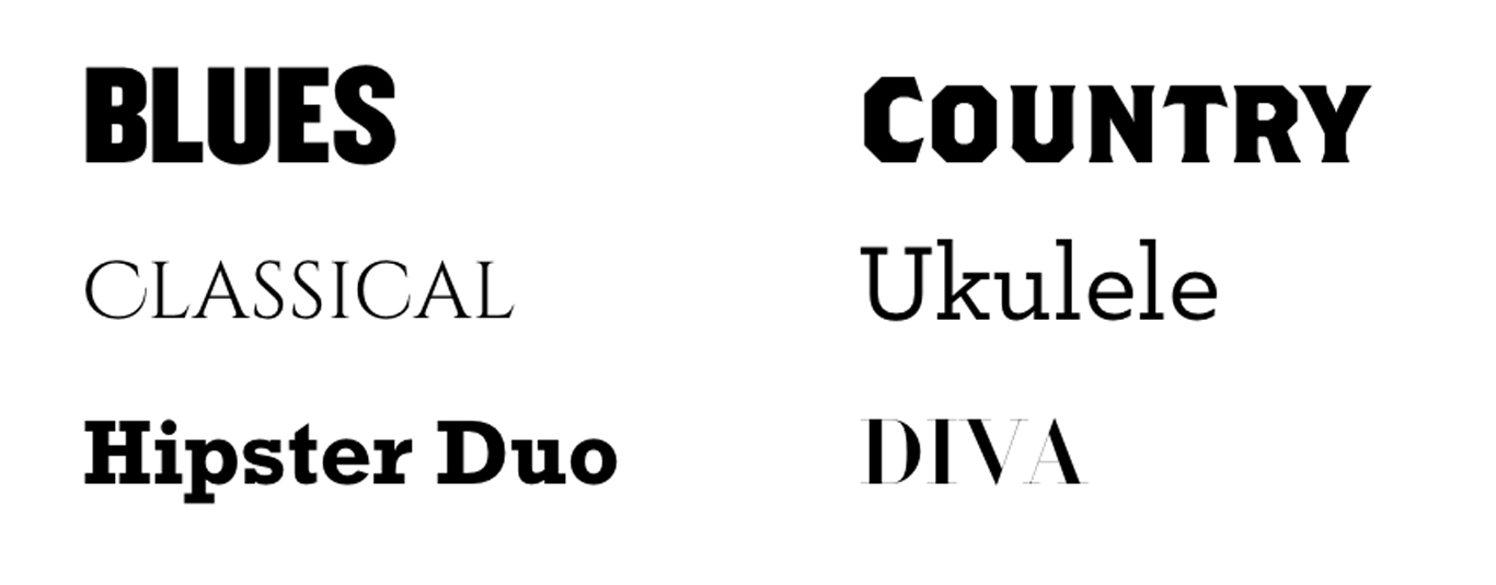
So most of these fit well with our adjectives. "Sophisticated" is our Classical genre, our "Playful" is a fun Ukulele, "Approachable" is a cute hipster duo, and our "Exclusive" font is a now a Diva.
Blues and country have taken on our "Strong" and "Reliable" fonts respectively. I'm not sure I would necessarily use those adjectives for those genres, but they somewhat work.
What is working well is the history of those typefaces. The "Strong" compact font is of a particular era where you might see that font on early poster design for blues artists.
Our country font is a woodcut font that you might see back in the turn of the century, and might associate it with early western America. So in this case the tone is dictated by the history.
Tone depending on context
In the "Sophisticated" example above, I used the free font Cinzel by Natanael Gama. FontSquirrel describes the font as:
"Cinzel is a typeface inspired in first century roman inscriptions, and based on classical proportions."
Because Cinzel was inspired by early Roman engravings, the characters have a certain feel to them. So you could easily see this font being used for a symphony orchestra or classical artists.
But, as soon as you open up the kerning (the space between characters), make it red on a black background you now have a pretty fitting metal logo.
![]()
Why does this work? Well, the Roman engravings also have some really interesting serifs that taper off into a sharp point. I also think because this font was based on engravings, it means it's a bit similar to a font you might see on a gravestone. What's more metal than a gravestone?
While this doesn't work with every font, I wanted to show that sometimes the tiniest changes can change the tone of the font.
Design a professional website in just a few clicks! Build your band website with Bandzoogle today.
Setting up your headings
So once you have the tone of your font choices, you need to be sure they work in context with your band’s website. Here are some quick tips on making sure your content is set up for easy reading when pairing your fonts.
The importance of contrast
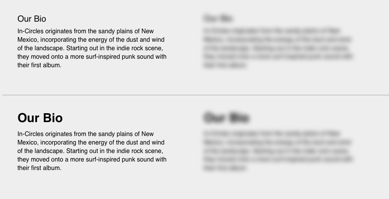
One key aspect of typography and font pairing is to present enough contrast between your font choices so that the reader can easily scan your site and pick up where content is beginning and ending.
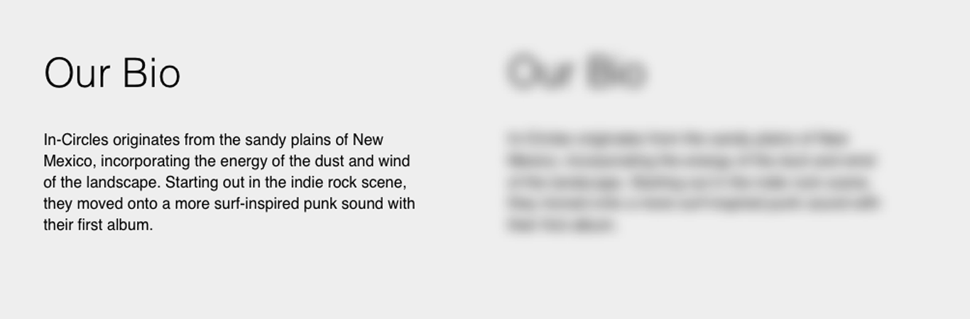
At the top of the example below, we have a pretty small font size as our heading which also has the same weight as the body copy below it.
Isolated it actually doesn't look too bad. But a nice designer trick I picked up from my fine art training is to blur your eyes to really see if this combo works.
Once you blur your eyes you can clearly see that the heading bleeds into the body copy in the top example. If this were on a large page of content and I was scanning to look for certain content, it would be really hard to find what I was looking for as the headings just disappear.
On the bottom we tweaked the heading to be larger and bolder, so you can see clearly discern the heading and body copy when blurred.
You can even create contrast without using a bold font. In this example I have a thin sans-serif, but because I've increased the size and opened up some whitespace below it, it clearly defines the beginning of where the body content starts.
Choosing a body font
Now that we know how to create contrast and what to look for in a heading font, let’s look at the body font. Body fonts are the paragraphs of text that make up much of your site, so I typically stay away from anything goofy like a display font, and sometimes even most serifs.
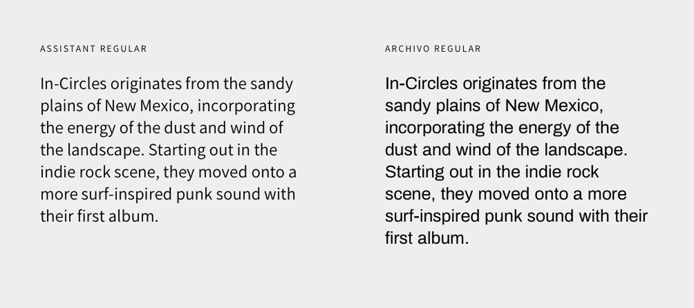
Your body font is the workhorse and it needs to be read easily. And even though this font needs to be easily read, it doesn't mean it can't convey tone. In the example below are two very different sans serif fonts, but both equally readable.
Assistant, on the left, to me looks much more approachable and friendly. Archivo on the other hand is a little bit thicker and a little bit more rigid in its construction. All the lowercase letters have a similar width and makes the font seem a bit more mechanical in tone.
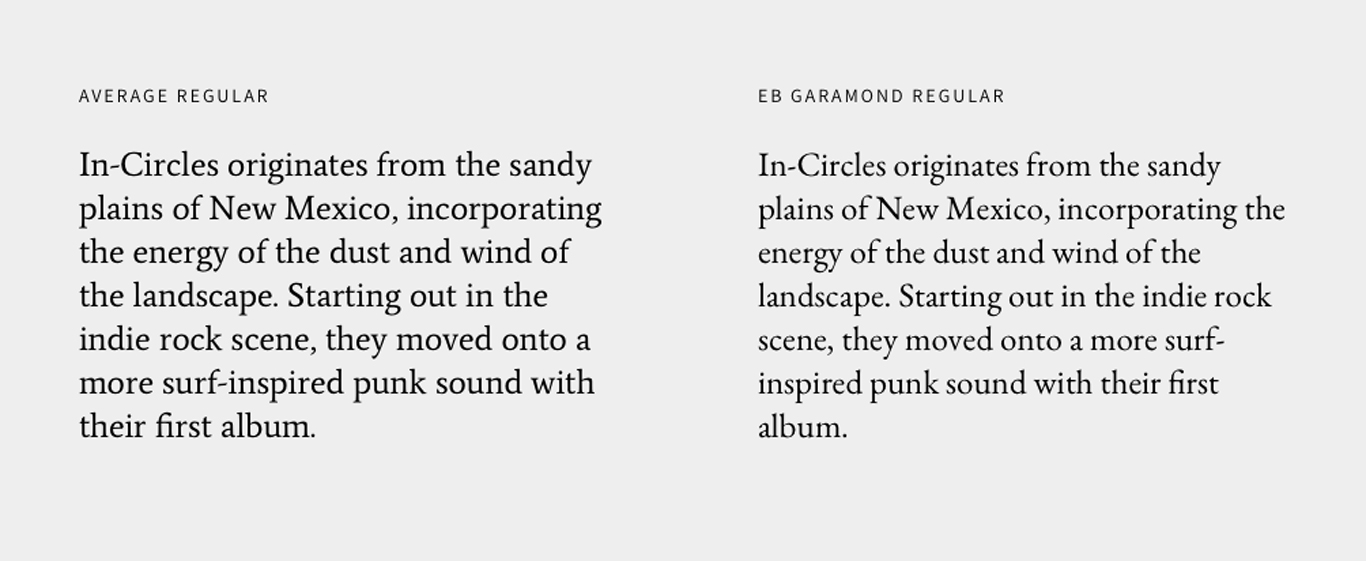
Serif fonts are the same way. These two examples are very readable at small sizes, but have different tones. Garamond has more variation in height between its capital letters and lowercase which to me, conveys a more literary/distinguished feel. Different tones but both very readable.
Further reading and resources
Hopefully this gets you thinking about how to choose the appropriate fonts for your band’s website. But if you're hungry for more, there's a ton of resources out there to feast on:
Inspiration
Reading
Elements of Typographic Style: The be-all end-all of typography.
A Type Primer: Easy entry point for learning typography.
Affordable places to get fonts
Google Fonts (free)
FontSquirrel (free)
LostType (free for personal use and affordable commercial licenses)
Why not share this with your friends?
Build a stunning band website and store in minutes
- Promote your music on your own unique website.
- Sell music & merch directly to your fans. Keep 100%.
- Grow your fan base with built-in marketing tools.
Free 30 day trial, no credit card needed.

Comments